

Imagine a symbol that captures the essence of passion, history, and unyielding loyalty. Now, splash it with vibrant orange and rich brown hues—you’ve just conjured the unmistakable Cleveland Browns logo.
This emblem isn’t merely a design; it’s a beacon that unites a community and reverberates through the heart of professional sports.
Today, we’re delving deep into the fabric of this iconic insignia. From its humble origins to the modern twists, tracing its lineage is like walking through a living football anthology.
You’ll discover the craftsmanship behind its timeless appearance and how it epitomizes the spirit of the Dawg Pound. Every curve, every stripe on that helmet tells a story of grit, glory, and an unwavering bond with the city of Cleveland.
By the end, expect to possess a richer understanding of:
- The storied evolution of the logo
- Its impact on team identity and fan culture
- Strategies behind sports branding and the designs that define teams
Join me as we unravel the threads of this striking NFL emblem, a tangible representation of sports heritage for the Cleveland Browns.
The Meaning Behind the Cleveland Browns Logo
![]()

You ever look at something and feel a burst of emotion? Like, a sense of pride or belonging? That’s what a good logo does. And the Cleveland Browns logo? It’s more than just a design on paper.
A Symbol of Grit
Right. So, the Cleveland Browns logo, in its simplicity, embodies the spirit of the team and the city it represents. The hardworking people of Cleveland see themselves in the determination and resilience of the Browns. The logo isn’t just a brand stamp—it’s a mirror to the soul of the city.
Reflecting Heritage
The Browns’ name itself has roots in history, being named after the original coach, Paul Brown. It’s not about color or flash—it’s about legacy, dedication, and history. The logo maintains its simplicity to highlight and prioritize this homage to its roots.
The History of the Cleveland Browns Logo
![]()

Man, this journey? Wild.
The Evolution
Started in 1946, the Browns have seen a roller coaster of designs. But here’s the thing: while the design elements evolved, the ethos remained unchanged.
Early on, there was no logo, just a simple leather helmet. By the 50s, we saw a quirky little elf named “Brownie” making an appearance.
But fast forward to the 70s? Enter the iconic orange helmet. No flashy symbols, no intricate designs. Just the helmet. That’s the Browns for you—unpretentious and real.
Significant Changes
In the past few years, there have been tweaks—shade variations, slight logo repositioning, and even changes to the face mask’s look. But the heart? It’s still beating strong with that original energy.
The Colors of the Cleveland Browns Logo

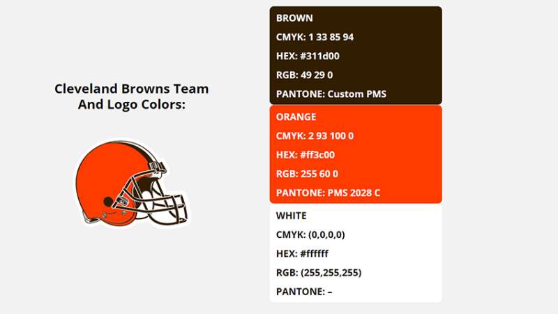
Orange: More than a Color
It’s fire. It’s enthusiasm. It’s passion. When you see that distinct shade of orange, you know what’s up. It stands out in the crowd, a beacon of identity.
Seal Brown: Grounded Reality
It’s not just brown—it’s Seal Brown. Earthy, strong, and rooted. Just like the team’s foundation. It balances the vibrant orange, grounding the logo and giving it depth.
The Font Used in the Cleveland Browns Logo

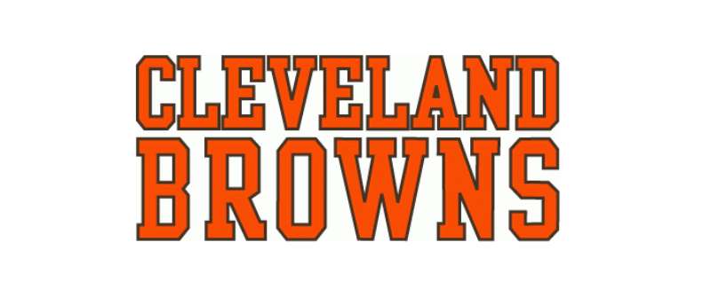
Modern. Bold. Dynamic.
Fonts tell a story. And the Cleveland Browns logo font? It shouts “boldness” without being obnoxious. The typography has a modern edge but carries a weight that commands respect. It’s not just about readability, it’s about character.
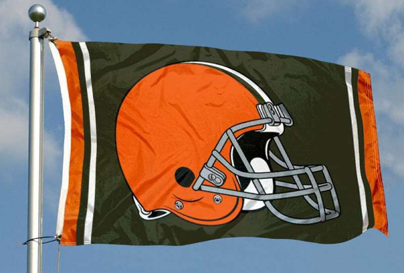
The Iconic Helmet Design
Now, you might wonder, “Why a helmet?” Here’s the scoop:
Safety First, Always
Football is intense. The helmet? A symbol of protection, resilience, and strategy. Just like how the Browns navigate their games.
Stand Out Without Trying
In a sea of mascots and symbols, the helmet is distinct. It’s immediately recognizable, and it’s pure Browns. No fluff.
Fans’ Love Affair with the Logo
Beyond the Game
For true fans, the logo is tattooed not just on merchandise but on their hearts. It’s a symbol of shared moments, victories, and hope.
Stories in Every Stitch

From jerseys worn with pride to flags waving high, there’s a story behind every piece of logo-emblazoned memorabilia. The fans and the logo? It’s an eternal love story.
FAQ On The Cleveland Browns Logo
Why did the Cleveland Browns choose their current logo?
The Browns embraced their unmistakable orange helmet as a prideful symbol of simplicity and tradition. It reflects their unique identity within the NFL and connects to Cleveland’s rich football culture, creating a bond between the team and the hardy Dawg Pound.
The visual simplicity stands out in the sea of complex sports logos.
What does the color scheme of the Browns’ logo represent?
The Cleveland Browns’ color scheme is a nod to their heritage. The orange signifies energy and vibrancy, while the brown evokes stability, resilience, and a connection to the earth—much like the grit and determination seen in their play on the field and the unwavering loyalty of their fan gear-adorned supporters.
Has the Cleveland Browns logo changed over the years?
Subtly morphing, the Browns’ logo has seen aesthetic tweaks but has always honored its origins. Slight color adjustments and modernizing lines have occurred, ensuring the emblem remains relevant in contemporary sports branding.
Despite changes, it continually channels the team’s enduring character.
Are there alternative logos for the Cleveland Browns?
Indeed, the Browns have secondary logos, like the iconic “Brownie the Elf” and Dawg Pound graphics.
These serve various purposes, from merchandise to alternative branding on marketing material, ensuring the team’s visual identity has versatility while echoing the primary helmet-based logo’s gridiron roots.
Why don’t the Cleveland Browns have their logo on their helmet?
The Browns’ bare helmet is a trademark statement, signifying the team’s commitment to its history and a standout defiance of NFL logo traditions.
This stark contrast serves to spotlight the team’s unique branding approach, embracing an unadorned helmet as a powerful and recognizable entity.
How does the Browns’ logo impact their merchandise sales?
The iconic Browns’ logo boosts merchandise sales by evoking a strong emotional connection.
The clean design appeals to a broad audience, resulting in a significant traction in sports franchise merchandise sales, as enthusiastic fans proudly don Cleveland sports gear, transforming logos into wearable badges of honor.
What is the cultural significance of the Cleveland Browns logo in Ohio?
In Ohio, the Browns’ logo transcends sports; it’s a cultural emblem. Signifying unity, perseverance, and history, it’s woven into Ohio’s social tapestry.
Football Sundays aren’t just about the game; they’re gatherings where the logo symbolizes communal pride and an unwavering bond.
Does the Cleveland Browns logo reflect the city’s history?
Absolutely. The logo mirrors Cleveland’s industrial roots, using a hard, robust design. It’s reflective of the city’s working-class ethos—a visual reminder of Cleveland, Ohio’s resilient spirit. This isn’t just a team emblem; it’s a homage to local history and collective memory.
Has the fan base reacted positively to the logo over time?
Yes, the logo has mostly seen a positive reception. It stands as a testament to tradition, an aspect deeply revered by the fan base. While team aesthetics evolve, nostalgic affection for the Browns’ logo remains, with fans cherishing its continuity in an ever-changing sports landscape.
What might future iterations of the Cleveland Browns logo look like?
Future iterations of the logo seamlessly blend heritage with innovation, striking a balance between revered tradition and a fresh, forward-thinking design ethic.
It’s likely that the essence will remain the same, crafted to resonate with emerging generations while paying homage to its historic roots.
Conclusion
In essence, the Cleveland Browns logo is more than a mere visual representation of a football franchise. It embodies the tenacity of a city and the fervor of its fanatics. Through each evolution, whether subtle shifts in color or form, it retains a steadfast connection to Cleveland’s cultural heartbeat.
This journey through the emblem’s origins and its tapestry in the annals of NFL lore uncovers its resonance—beyond mere gridiron battles. It represents a communal identity, a symbol proudly worn and a brand fiercely supported. Every mention of the logo ignites memories, a shared language between fans, the city, and the sports merchandise that flies off the shelves.
As we conclude, remember the Browns’ logo as a steadfast beacon of tradition in modern sports. Its significance is ingrained, its future as vibrant as the orange that defines it. May it always remind us of Sunday’s spirit, the chase of victory, the joy and sometimes heartbreak—each stitched into the vast quilt of professional football.
If you liked this article about the Cleveland Browns logo, you should check out this article about the Jacksonville Jaguars logo.
There are also similar articles discussing the Tampa Bay Buccaneers logo, the New York Giants logo, the Cincinnati Bengals logo, and the Los Angeles Rams logo.
And let’s not forget about articles on the Miami Dolphins logo, the Las Vegas Raiders logo, the Baltimore Ravens logo, and the Detroit Lions logo.