

Picture a fierce herd stampeding across the gridiron, a symbol igniting the hearts of thousands. This isn’t just any emblem—it’s the Buffalo Bills logo, an icon resonating with energy and spirit synonymous with the franchise.
Within the combat of linemen and the ballet of quarterbacks, logos carry a saga. My insight into the Buffalo Bills’ visual identity, armed with hues of royal blue and red, dives into the emblem that rallies the “Bills Mafia” and echoes in the rafters of the New Era Field.
You will learn the remarkable alchemy of sports design—how a solitary graphic encapsulates history, evokes emotion, and brands a legacy.
Discover the nuances crafting a logo that not only stands the test of time but also captures the zest of its fanbase.
Journey through the evolution, significance, and artistry of an NFL emblem that is more than a symbol; it’s the heart of Buffalo.
The Meaning Behind the Buffalo Bills Logo

Symbolism and Pride
You ever look at a logo and wonder, “What’s the deal here?” The Buffalo Bills logo is so much more than a cool buffalo chillin’ with a red streak. It stands as a symbol of pride for the city of Buffalo, its fans, and even those who just admire the sport.
The Charge Forward
That cool red streak? It’s not just there for fun. It symbolizes forward movement and momentum. Think of it as the Buffalo always charging forward, just like the team on the field. No matter the challenge, they keep pushing.
The History of the Buffalo Bills Logo

Origins and Transformations
Dude, this logo’s seen its days. From its early incarnations to the emblem we recognize today, the logo’s evolution has been as dynamic as the game itself. It’s like a caterpillar turning into a butterfly, but, y’know, more sports-y.
Moments that Matter
There have been iconic moments where the logo itself has played a part in memorable scenes, celebrated touchdowns, and fan gatherings. It’s like this logo’s had a life of its own.
The Colors of the Buffalo Bills Logo

Blue, Red and… More Blue?
Okay, so, colors. They’re not just there because they look good. The Royal Blue represents strength and determination.
Then there’s the Red. It’s not just any red. It’s the kind that screams passion and energy. It’s like the heartbeat of the team.
The Emotional Impact
Colors speak, dude! Every time fans wear these colors, it’s like a shared emotion, a united front. The colors resonate with the fans’ loyalty and pride.
The Font Used in the Buffalo Bills Logo

A Bold Choice
When we talk fonts, the Bills didn’t just pick one out of a hat. The font in their logo screams boldness. It’s robust, it’s strong, and it stands tall. Kinda like the team itself.
Font Evolution
Over the years, as with everything else, there’s been some tweaking here and there. But that core essence, that vibe of resilience, remains.
Behind the Designer’s Lens
A Designer’s Perspective
Designing a logo? It’s no walk in the park. It’s about capturing the soul of the brand.
The Buffalo Bills logo, with its colors, font, and design, is the result of many a brainstorming session, sketches, and of course, a lot of coffee.
The Importance of Iteration
Logos don’t just pop out perfect. There’s iteration. There’s feedback. And then some more iteration.
The Buffalo Bills logo has been through this journey, refining and evolving to the masterpiece we see today.
The Global Impact of the Buffalo Bills Logo
More than Just a U.S. Phenomenon
Sports transcend borders, and so do logos. Fans across oceans sport jerseys with the Buffalo Bills logo. It’s become a global symbol of admiration for the sport and the team.
Branding and Merch Madness

From caps to tees, from mugs to keychains, the Buffalo Bills logo is everywhere. Its design aesthetics and color palette make it a favorite not just among fans, but even among those who appreciate good design. It’s more than a logo; it’s a brand statement.
FAQ On The Buffalo Bills Logo
What does the Buffalo Bills logo represent?
The logo, with its charging buffalo, epitomizes a spirit of renowned strength and relentless drive. It embodies Buffalo’s spirited ethos, capturing the essence of both the team and its city.
The choice of colors and the animal itself symbolize the resilience and dynamic vigor synonymous with the franchise.
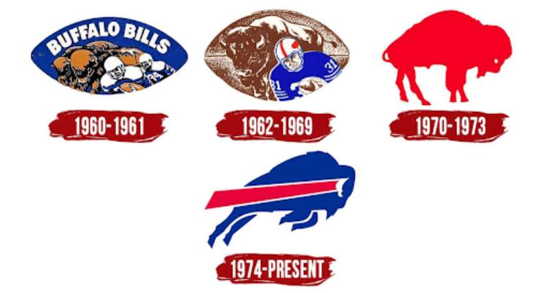
How has the Buffalo Bills logo evolved over time?
From its inception, the emblem has seen iterations that subtly refine its visage. Initially, a standing bison was depicted, which eventually charged forward with the modern era.
Each transformation retained core elements, ensuring the logo’s history and tradition continued to galvanize fans.
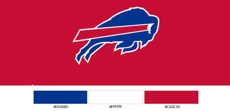
What are the official colors of the Buffalo Bills logo?
Royal blue, red, white, and navy blue—these are the stalwarts that give life to the logo.
Each hue plays a role in crafting an image that leaps off merchandise, tickets, and every televised game, fostering a readily identifiable brand for the team and its fervent fan base.
Why was the buffalo chosen for the Buffalo Bills logo?
The buffalo was not merely chosen; it was inherent to the team’s identity, reflecting the historical and cultural significance of the buffalo to the region.
Its indomitable character and the city’s name are locked in a symbolic dance that has lasted through decades of NFL seasons.
When was the Buffalo Bills logo first designed?
The team’s first logo saw the light of day in the early 1960s when the franchise took its first steps in the AFL.
With eyes on establishing a memorable identity, the designers sought an emblem that could garner attention and pique interest, giving birth to the now-iconic logo.
Have any famous graphic designers worked on the Buffalo Bills logo?
While no single designer’s fame shadows the creation of the logo, the emblem itself became an integral part of professional sports branding.
Designers over the years have honored the original vision while ensuring its maturity alongside evolving graphical trends in sports.
What elements are included in the Buffalo Bills logo?
Fiery red for passion, deep blue for conviction, and the steely silhouette of a buffalo in mid-stride.
These potent elements coalesce to form a logo that’s both visually striking and emotionally resonant, encapsulating the Buffalo Bills’ identity in a snapshot of color and form.
Is the Buffalo Bills logo trademarked?
Certainly. Like any professional sports emblem, it’s a legally protected asset, ensuring its exclusive use for the team’s merchandise, advertising, and public presence.
It stands guarded against misuse, preserving its integrity as a cornerstone of the franchise’s identity.
How often is the Buffalo Bills logo used in marketing?
Continually. It’s a linchpin for any marketing endeavor connected to the team—from social media campaigns to NFL merchandise.
The recognizable symbol serves as a beacon for sports enthusiasts and marketers, collaborating to foster team spirit and sales alike.
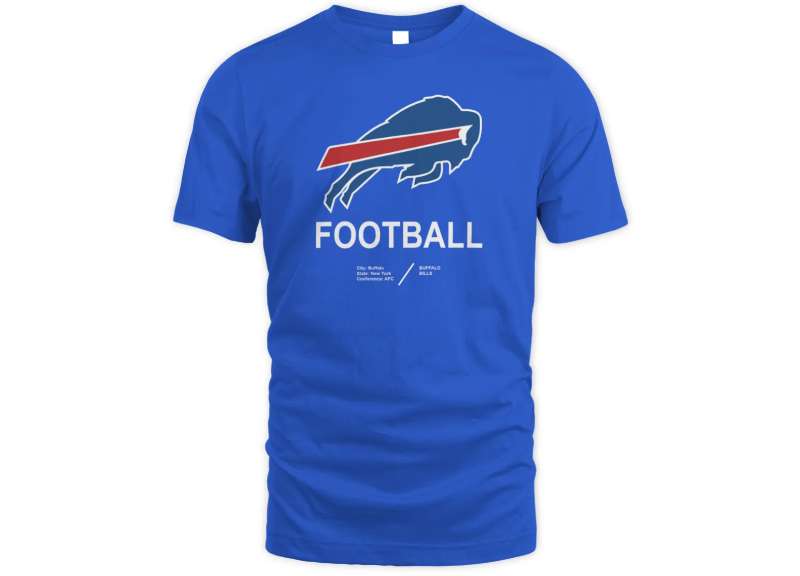
What merchandise features the Buffalo Bills logo?
Endless streams of merchandise—jerseys, hats, flags, and even those decals adorning the bumpers of cars crisscrossing Buffalo.
The logo graces virtually any tangible good you can associate with fan culture, ensuring supporters display their loyalty with unflinching pride.
Conclusion
In the dance of design and identity, the Buffalo Bills logo stands as a masterful composition of form, tradition, and spirit. Through the decades, this emblem has not merely been a static symbol but one that evolved, paralleling the team’s and city’s journey—a visual dialogue representing resilience, community, and drive.
It’s been etched on memorabilia, woven into the fabric of jerseys, and has risen, a sentinel, against the sky on countless flags. With each game’s close, it’s not just the numbers on the scoreboard that recount the day’s battle; this logo too whispers the tales of triumphs, trials, and collective breaths held in unison.
As the colors of royal blue, red, and white persist in the hearts of the “Bills Mafia,” they adorn each piece of fan gear with the weight of heritage. The legacy sealed within the logo serves as a beacon, a North Star, guiding the Buffalo Bills through the ebbs and flows of seasons yet to unfold.
If you liked this article about the Buffalo Bills logo, you should check out this article about the Dallas Cowboys logo.
There are also similar articles discussing the Denver Broncos logo, the Green Bay Packers logo, the New England Patriots logo, and the Philadelphia Eagles logo.
And let’s not forget about articles on the Kansas City Chiefs logo, the Carolina Panthers logo, the Arizona Cardinals logo, and the Atlanta Falcons logo.