What Is Information Architecture and Why You Need It

Ever walked into a building so intuitively designed that you could find your way around without a map? That’s the essence of information architecture (IA)—but for the digital world.
Imagine a website. Now, strip away the colors, the graphics, and the flashy buttons. What you have left—the backbone—is IA. It organizes, structures, and labels content effectively so users can navigate and find info with ease. You don’t just bump into what you need by chance. It’s by design, a carefully crafted user experience.
Dive in, and I’ll dismantle the mystique of IA. By the end of our chat, you’ll get why a content hierarchy and navigational design are your silent salesmen. They can turn a casual browser into a loyal customer. We’ll unpack site mapping, because before you build, you gotta blueprint. I’ll show why usability testing isn’t just jargon—it’s the spell check for your site’s success. And when it comes to metadata and taxonomy, think of them as the secret sauce that gets Google to serve up your site.
Get set. It’s time to weave IA into your digital strategy like a pro.
Table of contents
- Principles of Information Architecture
- The Role of an Information Architect
- Developing Information Architecture
- Designing Website Hierarchy and Navigation
- Prototyping and Testing
- Real-World Examples and Case Studies
Principles of Information Architecture
Core Principles
Let’s chat about information architecture and why it’s the backbone of any awesome website.
Imagine walking into a library where the books are all over the place.
Chaos, right?
That’s where information architecture (IA) comes into play – it’s all about arranging our site’s content so people can find what they need without a headache.
Overview of Dan Brown’s eight principles of IA
Dan Brown, not the author of ‘The Da Vinci Code,’ but a super-smart UX guy, came up with these eight principles. They’re like the secret sauce to making your site user-friendly.
First off, we’ve got object placement. Think of it like setting up your living room. You wouldn’t hide your TV behind a couch! Same with info on your site – keep it visible and make sense.
Then there’s choices. Ever been to a restaurant with a ten-page menu? Overwhelming, right? Same deal here. Too many options on a website can freak people out. Keep it simple.
Disclosure is up next. It’s like giving people a sneak peek without throwing everything at them at once. It’s about balance – show enough to keep them interested, but don’t overwhelm.
Next, there’s exemplars. Show examples of content in categories. It’s like saying, “Hey, look! This is what you’ll find in this section.”
Front doors are crucial. Not everyone enters your site from the homepage. Each page should make sense on its own.
Then, multiple classifications. People think differently. What makes sense to you might not to someone else. Offer different ways to explore content.
Focused navigation is key. Don’t make users wade through irrelevant stuff to find what they need.
Lastly, growth. Plan for how your content will expand over time. You don’t want to outgrow your own site!
Application of these principles in web design
Applying these principles is like being a DJ at a party. You need to read the room (or in this case, your users) and adjust the tracks (your content).
Keep it user-centered. Remember, a good flow with intuitive navigation can make or break your site.
IA vs. UX vs. UI
This part’s crucial: understanding the difference between IA, UX, and UI. It’s like a burger: IA is the meat, UX is the whole experience of eating the burger, and UI is the presentation on the plate.
Differentiating between IA, UX, and UI
IA deals with structuring content (like our site map and navigation paths). It’s about making sure users find what they’re looking for. Think about site mapping and content classification.
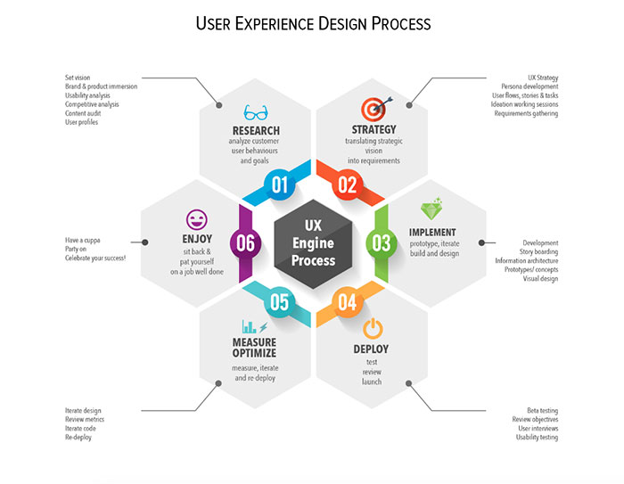
UX, or user experience, is broader. It’s how users feel when they interact with your site. It’s about the journey, from landing on the homepage to finding their desired info or product.
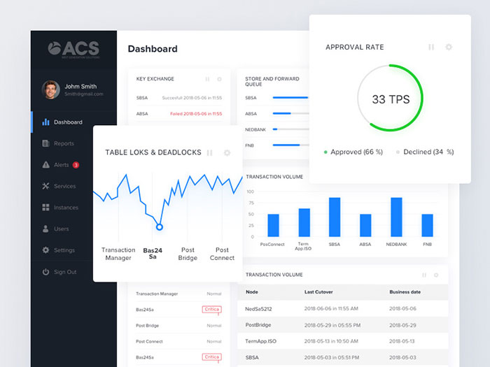
UI, user interface, is about the visual elements. It’s the buttons, icons, and colors – the things users interact with. It’s what makes the site not only functional but also pretty.
How IA serves as the foundation for UX and UI
Without solid IA, even the best UI/UX design can fall flat. IA is the foundation. Without it, you can’t build a stable structure, no matter how beautiful the design.
Get the information architecture right, and everything else follows more smoothly. It’s all about navigation design, ensuring usability testing is up to par, and making sure your content strategy is solid.
The Role of an Information Architect

Hey, let’s dive into what being an information architect is all about. Imagine you’re creating a map for a treasure hunt.
As an information architect, you’re doing something similar, but for websites. It’s a cool gig, where you make sure people can find the treasure, aka the info they need, without getting lost.
Responsibilities and Skills
Key responsibilities in organizing and structuring content
So, here’s the deal. The main job? It’s all about organizing stuff. Think of it like being a librarian for the digital world. You need to figure out where everything goes on a website, so people can find what they’re looking for, like, super fast.
- Content Strategy: You gotta have a plan for what content goes where. It’s not just about slapping info on a page. It’s about making sure that content is where users expect it to be.
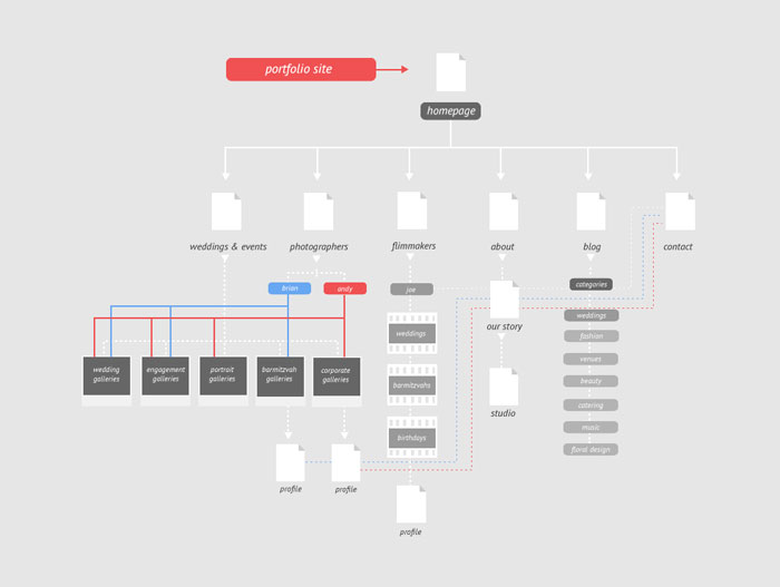
- Site Mapping: Like drawing a treasure map for the website. It shows which page leads where.
- User-Centric Design: Always thinking about how real people will use the site. It’s not just about making things look pretty; it’s about making them work well.
Essential skills for an effective information architect
- Empathy: You gotta put yourself in the users’ shoes. What do they want? How do they think?
- Technical Know-How: A bit of tech savvy is crucial. Knowing stuff like Adobe XD or Axure RP helps.
- Problem Solving: Websites can be like puzzles. You need to figure out the best way to fit all the pieces together.
- Communication: You’re not a lone wolf. Working with designers, developers, and content creators is a big part of the job.
Developing Information Architecture
Research and Analysis
Conducting customer and user research
It’s not just guessing what users want. You gotta do your homework:
- User Interviews: Chatting with real users to get into their heads.
- Surveys and Questionnaires: Sometimes, you gotta reach out to a bunch of people to see the bigger picture.
- Analyzing Data: Using tools like Google Analytics to see how people actually use a site.
Reviewing and updating content for relevance and accuracy
This part’s about keeping things fresh and relevant:
- Content Audits: Like a spring cleaning, but for website content.
- Usability Testing: Making sure people can use the site without wanting to pull their hair out.
- Accessibility Standards: Ensuring everyone, regardless of ability, can use the site.
Content Classification and Labeling
Applying card sorting for content taxonomy
It’s like a game. You sort cards (or content) into categories that make sense. It’s a great way to see how users think and categorize information.
Techniques for effective labeling and categorization
- Clear Labels: No one likes guesswork. Make sure your labels say exactly what they mean.
- Consistency: Stick to a pattern. If one part of your site uses certain terms, use them everywhere.
- User Language: Use words that your audience understands, not just technical jargon.
Designing Website Hierarchy and Navigation
Navigation Types
Exploring hierarchical, global, local, and contextual navigation
Navigation is like the GPS for your website:
- Hierarchical: The classic tree structure. It’s like a family tree, but for pages.
- Global: The main menu that’s usually at the top. It’s like the main roads on a map.
- Local: These are like the little signs that show you what’s on this page or section.
- Contextual: Think links within the content that take you to related stuff.
Hierarchy Design Patterns
Selecting appropriate design patterns
Whether it’s a flat design or a deep hierarchy, it depends on the content. Like, a news site vs. a small business site – totally different needs.
Mind Mapping and Site Mapping
Utilizing mind maps for content visualization
Mind maps are rad for brainstorming and getting a visual on how content connects. It’s like doodling, but it actually helps sort out complex info.
Creating sitemaps for clear content hierarchy
Sitemaps are the blueprints. They show the structure of the site before any of the fancy design stuff happens. It’s all about making sure users won’t get lost.
Developing Information Architecture
This is where the magic happens, turning a bunch of ideas into a structured, easy-to-navigate website. It’s like being an architect, but for digital spaces.
Research and Analysis
Conducting customer and user research
First things first, gotta understand the people who’ll be using the site. It’s like detective work, but cooler.
- Surveys and Interviews: Chat up the users. What do they want? What do they hate? It’s all gold.
- Analytics: Dive into data like Google Analytics. It’s like reading a map of how users move through your site.
- User Personas: Sketch out the typical visitors. Are they tech-savvy? Are they there for quick info or deep dives?
Reviewing and updating content for relevance and accuracy
Content is king, right? But it’s gotta be the right content.
- Content Audits: Like a wardrobe revamp. Chuck out the outdated stuff, keep the classics, and add some fresh pieces.
- Fact-Checking: No fake news here. Everything should be as accurate as a sniper.
- Updating Regularly: Keep things fresh. No one likes stale bread, or content.
Content Classification and Labeling
Applying card sorting for content taxonomy
This part’s a bit like playing cards but with ideas. Sorting out what goes where. It’s like organizing a puzzle so that it makes sense at first glance.
- Open Card Sorting: Let users group content their way. It’s like a choose-your-own-adventure book.
- Closed Card Sorting: Give users predefined categories. More like a guided tour.
Techniques for effective labeling and categorization
It’s all about making things super clear and easy to find.
- Clear, Descriptive Labels: No riddles or cryptic stuff. If it’s a contact page, just call it “Contact.”
- Consistency is Key: Stick to a pattern. Don’t call it “Contact” in one place and “Talk to Us” in another.
- Speak the User’s Language: No tech jargon. Keep it simple, like explaining it to a friend.
Designing Website Hierarchy and Navigation
Navigation Types
Here’s where we decide how people will move around the site. Think of it as building roads in a city.
- Hierarchical Navigation: Classic and straightforward. Like a family tree, but for web pages.
- Global Navigation: The main menu – it’s like the highway that connects everything.
- Local Navigation: Small side streets, guiding users through a section of the site.
- Contextual Navigation: Little hidden gems. Links within content that lead to more cool stuff.
Hierarchy Design Patterns
Choosing the right design pattern is key. It’s like choosing the right outfit for a party – it’s gotta fit the vibe.
- Flat vs. Deep Hierarchies: Flat’s easy and straightforward. Deep is more for the explorers, lots to dig through.
- Balance is Essential: Too flat, and it’s boring; too deep, and it’s a maze.
Mind Mapping and Site Mapping
The fun part – drawing the treasure map.
- Mind Mapping: Get all ideas out of the brain and onto paper. It’s messy, but it’s supposed to be.
- Site Mapping: The blueprint of the site. It’s organized, clear, and shows how everything connects.
Designing Website Hierarchy and Navigation
Diving into the world of website design, it’s like crafting a digital map.
It’s all about guiding visitors through a journey, making sure they find what they’re looking for without getting lost in the maze of pages.
That’s where information architecture plays a starring role. It’s the unsung hero behind every smooth, user-friendly website.
Navigation Types
Picture this: you’re entering a huge, sprawling library. How do you find that one book you need? The sections, signs, and labels guide you. That’s what different types of navigation do on a website.
- Hierarchical Navigation is like a family tree. You start from the top and work your way down. It’s clean, simple, and great for sites with a clear, top-down structure.
- Global Navigation is your compass. It’s consistent, always there, guiding you across the main sections of the site, no matter where you are.
- Local Navigation zooms in on the neighborhood. It’s all about exploring the nearby streets – the subsections of a site.
- Contextual Navigation is like those helpful suggestions you get: “If you liked this, you might also like…” It links related content, making the journey intriguing.
Each type serves a purpose, like tools in a toolbox. They work together, creating a web of paths that lead users to their destination.
Hierarchy Design Patterns
Now, let’s talk about organizing these paths. Imagine you’re setting up a festival. Where do you put the stages, food stalls, and restrooms? That’s what designing a hierarchy is like. You decide what goes where.
- Flat Structure is like a wide-open field with everything in plain sight. It’s superb for smaller websites, as it puts everything a few clicks away.
- Strict Hierarchy is more like a multi-level building. You have floors (main categories) and rooms (subcategories). It’s orderly and works wonders for content-heavy sites.
It’s not just about slapping things together. It’s about crafting a flow that feels natural and intuitive. Like placing the food stalls where people get hungry.
Mind Mapping and Site Mapping
Mind mapping in web design?
Absolutely!
It’s like sketching your thoughts on a napkin. You start with a central idea – your main page – and branch out. It’s spontaneous, creative, and helps visualize the journey through your site.
Site mapping is the next step. It’s turning that napkin sketch into a detailed blueprint. Every page, every link, laid out clearly. You’re not just building a website; you’re architecting an experience.
This process uses all those fancy terms – information architecture, user experience design, interaction design. But at its core, it’s about understanding people. What they need, where they might go next, what will make their visit enjoyable.
Content strategy, usability testing, wireframing – they’re all part of this grand design. It’s a dance between creativity and logic, between what looks good and what works well.
Prototyping and Testing
Imagine you’re crafting a masterpiece, not with brushes and paints, but with ideas and pixels.
That’s the heart of prototyping and testing in the world of information architecture.
Wireframing and Data Modeling
Think of wireframing like sketching your dream house before building it.
You draw where the windows go, how the doors open, mapping out the flow from room to room. It’s the blueprint of your website. But it’s not just about pretty layouts. It’s about making sense of the chaos.
Data modeling, on the other hand, is like digging into the guts of the system.
It’s figuring out how your data – all those bits of information – fit together. Imagine it like a puzzle, where each piece is a chunk of data, and you’re trying to see the big picture. It’s all about understanding how user flow diagrams or website analytics play a role.
Testing Methods
Now comes the real fun – testing. It’s like inviting friends over to test out that new recipe you’ve been experimenting with. You watch their reactions, see if they go for seconds, and ask for honest feedback.
- Usability Testing is like watching someone navigate your newly designed maze. Do they find the cheese? Do they hit a dead end? It’s all about the user’s journey, their experience. You’re tuning into their actions, understanding their interactions with your site. It’s about refining the user interface layouts and making sure the navigation systems are on point.
- Then there’s Iterative Testing, the art of rinse and repeat. You tweak, adjust, and test again. It’s a loop, but a creative one. Each cycle is a step closer to perfection. You’re not just building a website; you’re crafting an experience.
Every test, every iteration, is a brushstroke in the bigger picture.
Real-World Examples and Case Studies
Analysis of Successful IA Implementations
Ever wondered how Spotify seems to read your mind with its playlists? Or how IMDB effortlessly guides you through a labyrinth of movie information?
It’s all about information architecture in action.
Take Spotify.
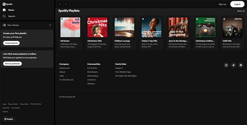
It’s a symphony of user experience design and content strategy.
Their navigation systems let you flow from discovering new songs to revisiting old favorites seamlessly. They use terms like playlists, genres, and artists to create a taxonomy, a classification system that feels almost intuitive.
Then, there’s IMDB.
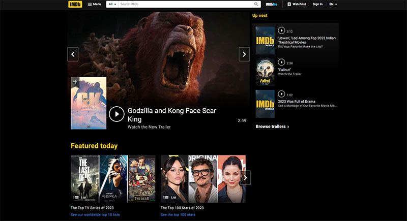
It’s like a digital encyclopedia for movies, and yet, you don’t get lost. Their information architecture is a mesh of hierarchical navigation and contextual navigation.
Looking for a movie? You’ll find genres, actors, and directors linked in a way that makes sense. It’s interaction design at its best.
These aren’t just websites; they’re experiences.
Lessons Learned
What can we glean from these digital success stories? First off, information architecture isn’t a one-size-fits-all deal. It’s about understanding your audience, their needs, and behaviors.
- User-Centered Design is key. Like how Spotify understands your music taste, designing for the user makes a world of difference. It’s about using wireframing and usability testing to craft a journey that feels personal.
- Content Management Systems are the backbone. They’re like the stage crew, working behind the scenes to ensure everything runs smoothly. Whether it’s managing a massive library of songs or a database of movies, the system needs to be robust yet flexible.
- Search Engine Optimization is crucial. Using terms like streaming services or movie databases, helps in not just attracting traffic but making sure it’s the right kind.
- Finally, Iterative Testing. It’s about evolving, adapting. Both Spotify and IMDB didn’t just build their sites and call it a day. They kept tweaking, improving, making sure they stay relevant and user-friendly.
FAQ on Information Architecture
What is information architecture?
Information architecture is the master plan of a site’s structure. Think of it like a digital librarian’s method—organizing, structuring, and labeling content so folks can find what they need without a hitch. It lays down how pages connect and guides visitors smoothly from A to B.
How does information architecture affect user experience?
Huge impact! Good IA equals intuitive navigation. It’s all about creating a seamless journey through a website structure. When users can cruise around and find what they’re hunting for, they’re happy campers, and that’s the gold medal in user experience.
Can you explain the difference between information architecture and UX design?
Alrighty! IA’s like the blueprint—focusing on content organization and site mapping. Now, UX design… that’s the bigger picture. It encompasses IA but also tackles the look, feel, and overall interaction with a site to reel in that top-notch user satisfaction.
What are the core components of a strong information architecture?
Core components, coming right up! We’re talking about a clear content hierarchy, logical navigational design, spot-on labeling systems, and meaningful taxonomy. Nail these, and you’ve laid down a solid foundation for a killer IA.
How important is information architecture for SEO?
Listen up, ’cause IA and SEO are like peas in a pod. Sprinkle your site with relevant metadata and a smart content strategy and watch Google become your new best friend, catapulting your site up the ranks with better indexing and, ultimately, more eyeballs on your pages.
What’s the deal with card sorting in information architecture?
Card sorting’s the secret weapon to get inside users’ heads. Hand ’em a stack of topics, let them sort ’em how they’d naturally think it fits, then bam!—you’ve got insights straight from the source for organizing your content that makes sense.
How does a content management system relate to information architecture?
A content management system, or CMS for the cool kids, is IA’s sidekick. It helps wrangle all your content under one roof, letting you structure and publish without breaking a sweat. A well-organized CMS reflects good IA and keeps things manageable as your site grows.
Why is user testing important for information architecture?
User testing is your reality check. You’ve built an IA; now toss it to the wild—real users. Watch ’em in action, see what stumps them, and tweak accordingly. It’s like proofreading your site’s usability before hitting ‘live’ and avoiding facepalms later.
In what way have mobile devices influenced information architecture?
Mobile devices shook up the game! We’re not just clickin’ and scrollin’ on desktops anymore. IA must evolve with responsive design and mobile-first approaches to ensure smooth sailing on smaller screens. It’s all about big impact with compact real estate.
How do you keep up with changes in information architecture best practices?
With the web ever-evolving, it pays to keep your ear to the ground. Follow gurus, chew on fresh articles, and mingle at meetups. Get cozy with user experience resources like the Nielsen Norman Group, and never stop testing and learning. Stay nimble, stay curious.
Conclusion
Unpacking information architecture, like discovering the hidden paths that make websites not only make sense but makes you feel like a pro.
- You’ve seen how vital content hierarchy is, it’s the super-glue that holds your pages together.
- You now get that taxonomy isn’t just fancy talk; it’s sorting stuff so you can find it again without breaking a sweat.
Wrap your head around these, and you’re well on your way to crafting spaces on the web that folks can glide through with the ease of a pro skater.
What’s next after mastering the arts of IA? Keep it fresh. Policies shift; user likes and dislikes do the tango. Stay quick on your toes, always watching, learning, evolving. Because that’s how you stay ahead in this digital dance. Now go, shape some killer experiences that’ll have people buzzing.
- The Konami Logo History, Colors, Font, And Meaning - 23 April 2024
- Summer Color Palettes for Hot Designs: 40 Examples - 23 April 2024
- Corporate Identity Examples Any Designer Should See - 23 April 2024


