


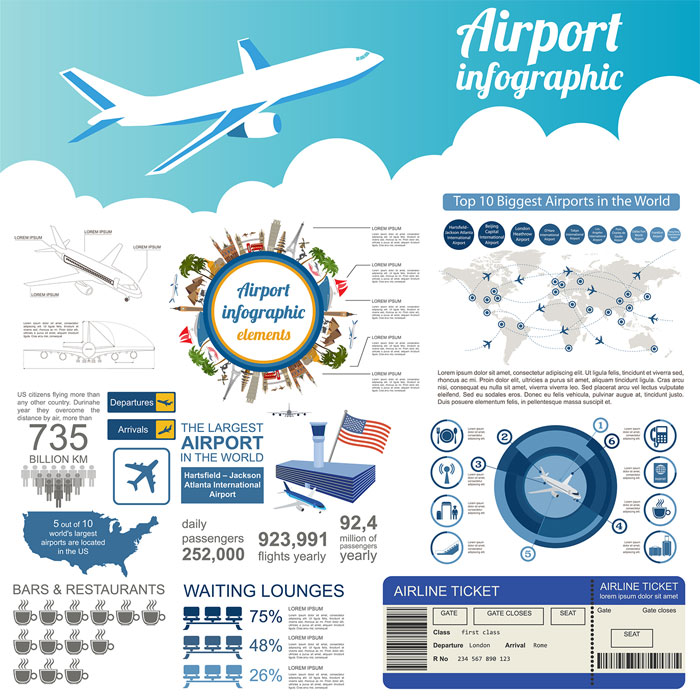
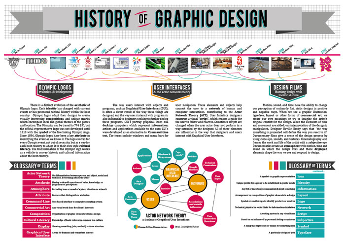
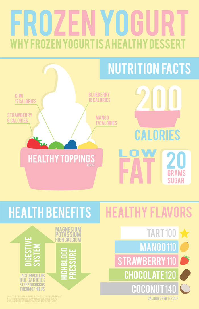
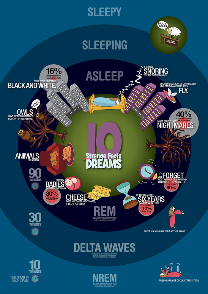
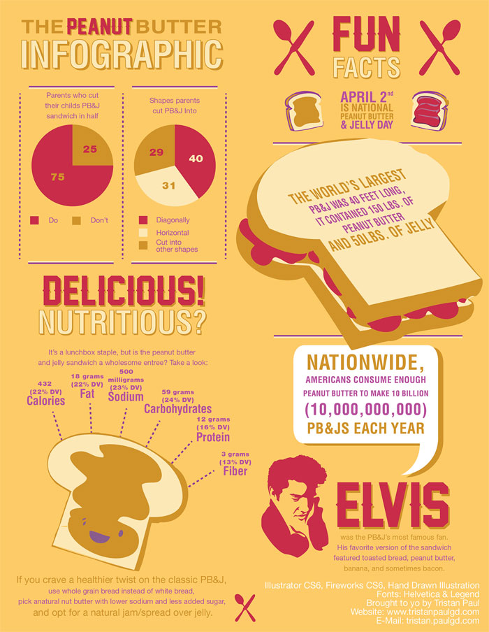
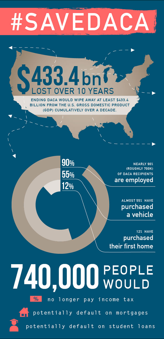
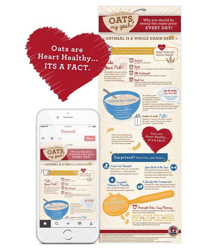
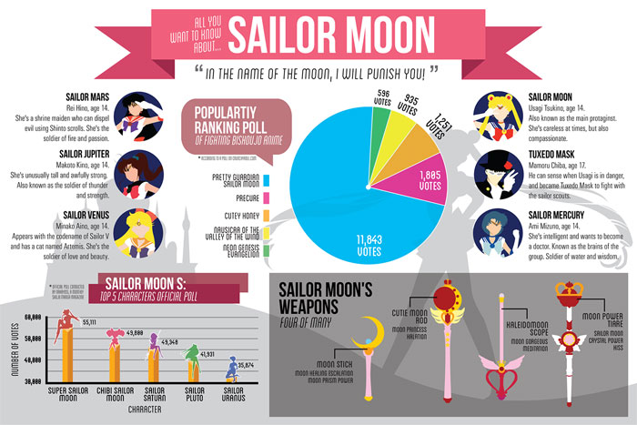
Infographic Examples And Ideas On How To Make Them
What’s an infographic? An infographic is a visual representation of data and/or information. The rise of the internet has made infographic examples incredibly common and has made good infographics invaluable for web design.
They communicate ideas to users quickly and effectively, catching the eye and making it more likely that users will follow a website’s call to action. Infographics have become key to a lot of web design in recent years since users want data quickly and in an easy-to-understand format.
If you want to make infographics, it’s important to make sure that the info you’re presenting is not left up to interpretation. Everyone who reads the infographic should reach the same conclusion.
Many infographics are similar to the sorts of charts and graphs that you can make in Microsoft Excel, simply with a lot more polish and often more text. Think of explanatory timelines, comparisons between products, and even instructional charts that you’ve seen. Those are all infographics. The best of them can even go viral if the designer is lucky.
Modern infographics pull together a lot of information to create a sleekly packaged piece of eye candy. Learning how to create infographics is a must for anyone looking to design even a small website. Infographic design is fairly simple and adheres to some basic principles.
The Basics of Infographic Design
Figuring out how to make an infographic is not like other forms of graphic design. You need to develop a specific sort of mindset in order to create great infographics. There’s a set of standards and you need to learn what effective data visualization looks like. It’s not something that even a veteran web designer can just make in half an hour. Here are a couple of rules to help you create an infographic:
Show, Don’t Tell
The first thing to remember is that good infographic designs show people data, they don’t tell them about it. You need to design an infographic that is visually stimulating, not a wall of text.
It should lead users to the conclusion you want them to make. You need to make sure the design tells a story. Avoid unnecessary complexity. Instead, make a simple infographic that has a clear point. If users wanted to read a wall of text, they already would. Users want an infographic that shows them clearly the info they want to see.
Choose the Right Kind of Chart Types
There’s no one right type of chart for all kinds of data. The data you’re using will determine what kind of chart you use for your infographic layout.
The first thing you need to do when deciding on a chart type determines what kind of data are you looking at and what you want it to mean. Are you trying to highlight an important number? Are you comparing two data points? Are you trying to show off a certain trend over time? Do you want to point out an outlier in the data set?
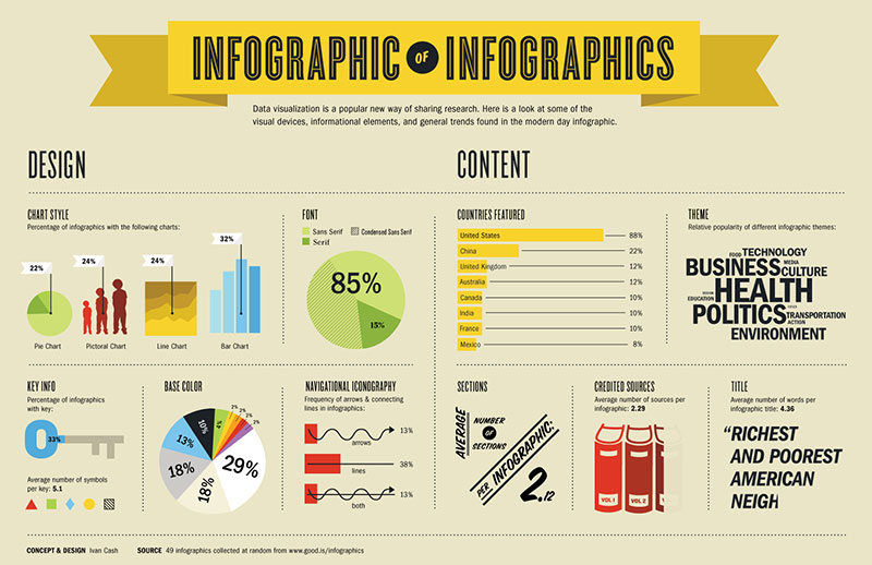
The most common types of charts used in infographic designs are pie charts, column graphs, line charts, and bar graphs. Each type excels at showing certain things.
Column graphs are good for comparing data. Line charts are great for showing a trend over time. Pie charts are good at demonstrating different fractions of one set of data. Bar graphs quickly demonstrate the differences between entire sets of data themselves.
There are more unusual options out here as well. If the chart shows off your data in the way you want, then go ahead and use it. Be creative. The most important thing about the chart is that it’s easy to read and clearly communicates the data. Sometimes an unconventional approach may be the best way to do this.
Make Sure You Have the Data You Need
Once you have an understanding of where you want to go with your infographic design, make sure you have all the data you need to pull it off. Figure out how the pieces come together to get your point across.
There may be gaps in what you have. You might have to do (or request) more research to help tell the story you want on the infographic. Learning how to recolonize this is one of the most difficult parts of learning how to make infographics.
Use a Wireframe

By using a wireframe to design your infographic, you start out with an excellent basis for creating a coherent infographic. Infographics are difficult to design because it’s easy to lose the thread of the story you want to tell. You will find yourself reorganizing data and text often.
Without a wireframe, you have to start from scratch. With one, you’ll be able to reorganize everything without dealing with a cluttered mess. This takes some time and a bit of effort, but it will make a big difference later on in the design process.
How to Make an Infographic
Once you have your data and an idea of what kind of chart you want to use for your infographic design, it’s time to start getting to work. The best infographics are carefully thought out and make good use of core graphic design principles. Here are some ideas to help you figure out how to create an infographic that looks modern and clear.
Use Contrast
Contrast is a great design tool. Place strikingly different element next to each other to make the infographic stand out. For instance, a light infographic background with bold foreground elements will automatically draw the eye to that bold foreground. If one color or set of colors is more prominent than the others, you create a useful visual hierarchy.
Pair complementary colors for great effect. Combine a dark blue infographic with brighter colors like orange or yellow for your text to make it stand out. Bright, highly differentiated colors are easier for viewers to see quickly. You only have a few moments to capture their attention, after all, and contrasting color is a great way to do it.
You can also contrast text sizes. Make the header the largest typography, with the sub-header second largest, and the body text smaller. The large header will allow viewers to know immediately what the infographic’s subject is.
If you’re careful, you can be particularly dramatic with your contrast by using a tinted image as your infographic background. Choose the image you use wisely. You don’t want to overwhelm the data you’re communicating.
Color

Contrasting colors are a smart thing to think about when considering how to make an infographic, but it’s not the only thing you should think about when considering your infographic’s colors. The right color palette can do a lot for the infographic’s effectiveness.
If you’re making an infographic for a brand, consider using the brand’s colors to help integrate the infographic example into their branding campaign. However, these colors may not work that well for an infographic, so take the time to play around with brand colors if you’re working with them. If you can’t use the brand’s exact colors, see if you can use shades of them.
It’s important to choose a color palette that the greatest number of people can read easily. Dark colors combined with neon colors, for instance, are hard for most people to read and they will usually scroll right past it rather than look at. Some color palettes and patterns can be painful to look at.
You should try to avoid using a white background if you can. Good infographic ideas are shared on numerous blogs, social media pages, and other websites. Many of these sites have white backgrounds already. If your infographic design already has a white background, it will blend into the website and figuring out where it begins and ends will be hard.
Regardless of the particular set of colors you choose, try to stick to three colors. Three-color palettes are very appealing and easy on the eyes. One color, typically the lightest, should be the background color.
The other two should be used to break up different sections of the infographic. If you still feel you need to add other colors for the best look, use shades of those three colors. This will keep the colors of the infographic coherent and prevent them from becoming jarring.
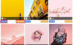
Using Photos
The best kinds of photos are ones that have been specifically taken for your infographic. However, this is not always an option. You can find royalty free images at many different websites, including Unsplash, Dreamstime, Bigstock, and Pixabay. Using these stock images is a good workaround, but they also carry a risk.
Using them can look cheesy and make it seem like you lack creativity. Be careful which stock photos you decide to use in your infographic layout.
Stock photos see a lot of use on the internet and anyone looking at your infographic’s subject has probably seen a lot of the same ones. Using these images can make it seem like you put the minimum amount of effort into creating the infographic.
All the photos you use, whether they were taken by a photographer for this infographic design or stock images from the web, should have consistent lighting and styling. They should have the same lighting effects and backdrops.
You don’t want the photos to distract from what you’re trying to communicate with the infographic. Using photos with flat color backdrops lends your infographic a modern look, while black and white photos fit with a more old-fashioned style.
Balance

Visual balance will help your infographic look better. It will be easier to read and more pleasant to look at. Balance helps keep all the elements of the infographic layout remain cohesive, which is especially vital for longer infographics. You can use both symmetrical and asymmetrical balance for your infographic design.
Symmetrical balance means both sides of the composition have equal visual weight. This is a great composition style for an infographic that’s comparing different data sets. It can be a bit dull, however.
Asymmetrical balance is more natural and doesn’t have the same dull uniformity of symmetrical infographic designs. It creates a more complex relationship between the different elements.
Asymmetrical balance is also more dynamic and avoids too much repetition. Some good infographic examples of asymmetrical balance in an infographic designs are the way text alternates sides on many timelines.
Consistency
An infographic draws together spate data elements to tell a single story with a clear point. The layout and design elements should remain consistent in order to achieve that effect. You should use the same bullet points for the same kinds of information.
You should use either filled in or line art icons throughout the infographic, not both. The same principle should apply to the images, font, and color palette you use in the infographic. This will prevent any sense of color and also make the infographic example look much more professional.
Simplicity
One of the core ideas behind infographics is that they break down complicated ideas into simple visual guides. You need to remember that as you create the infographic layout. It’s all too easy to let an infographic grow long and complex, cluttered with text and charts. Make an effort to keep your infographic design as simple as possible while still conveying all the info it should.
Focus
Don’t get wrapped up in placing every last fact and figure you can think of into the infographic. Streamline the info so that it remains focused on the story you’re trying to tell and the concepts you’re trying to communicate.
Viewers should come away from looking at your infographic thinking of the core concept, not feeling like they just looked at a lot of vaguely connected information.
Remember, infographics are a calculated collection of information, not a random assembly of facts. You want to drive home a single point. An infographic is not an info dump, but rather a coherent form of communication.
Keep it Easy to View
Resizing can play havoc with the readability of an infographic. You may design it to be a massive, screen-dominating image, but the website designer may end up downsizing it to make it fit on the website, resulting in an infographic that is now impossible to read.
If your infographic design gets shared on social media, you want people to be able to tell what it’s about on phone screens and in preview windows. Make sure that even the smallest element of your infographic is readable at smaller sizes without needing too much squinting.
Remember Your Target Audience
Remember to tailor your infographic to your target audience. Do some research into the best ways to communicate with the people you are designing the infographic for. Choose font, colors, and photos to better appeal to them.
If your infographic is meant to be viewed by a particular profession, like military, law enforcement, or medical professionals, make sure you use photos that match their actual uniform and conduct.
If you use professional insignia or logos, choose the correct ones. If you just snatch these elements off the internet without checking to see if they’re correct, your infographic will not be a source of information so much as a subject of mockery.
Take a Final Look at Every Element
Make sure you take a careful read through every element of the infographic. It can be tempting to just skim over anything you’ve typed or any copy you’ve been given, but take a look at every last word and number. Typos and strange formatting quirks make the infographic look unprofessional. Taking the time to read over your work will result in a more professional final product.
If you’re working for a client, reading over all the details of tour infographic before you submit it for review will save you time later. Submitting your work only to have it torn to pieces upon a client’s review is frustrating.
Creating the best infographics means knowing when there are holes in the data, making sure that everything important has been included, and knowing when the facts support the story that’s being told.
Create a Visual Hierarchy
Every infographic layout operates on a clearly defined visual hierarchy. This hierarchy uses a combination of information and graphic design elements to lead viewers through the infographic’s story to the ultimate call to action.
It unifies all the information and data on display. Use font size, color, and data arrangement to create this visual hierarchy. Without it, your infographic is just a random collection of facts without a clear point.
Think About Your Typography
While your infographic design should not be based entirely on typography, you are very likely going to use some text. You need to choose everything about your text wisely. It can make a big difference to whether or not your infographic catches people’s eyes or not.
Text size is important for numerous reasons. For one, it helps you establish your infographic’s visual hierarchy, easily identifying the most important information for viewers. You should also choose your text size to make the infographic easy to read in numerous sizes.
When it comes to font, try to use only two types of font that work well together. You can go with more elaborate font for headers and sub-headers since they are usually only a few words.
For longer chunks of text, use simpler fonts that are easy to read. Regardless of what you are using the font for, it should be easy for readers to distinguish between letters and words. You can still have fun with your font, but remember that your infographic needs to make sense to anyone reading it before anything else.
Don’t use typography as a crutch. Don’t use it to generate excitement that your infographic layout is failing to create. Good typography is another tool you can use to create interest and a visual hierarchy. Use it to help tell the infographic’s story.
Look for Examples
You don’t have to design an infographic all on your own. Take a look at how others have created infographic designs. Look at how the elements of the design come together to tell a story. Think about why everything works together well—or maybe not so well. One of the best ways to learn about any kind of design is from example.
This is defiantly true for infographic examples. If you get stuck in a creative rut with your infographic design, hop on the web and see what other people have done with theirs. You might find some really great infographic ideas that will help you pull everything together in your own work.
Promotion
Infographics can and do go viral. It doesn’t just happen. You need to be a bit calculating if you hope for your infographic design to get a lot of social media shares.
You need to promote your infographic. Treat it like any other piece of content you want people to see. Reach out to influential people in the niche to see if they’ll feature your infographic. Include social media share buttons when you feature the infographic on your website. Ask for users to share it with others.
Your infographic design can be absolutely spectacular, but without proper promotion, it will just languish in obscurity. You’ll need to work to get out there. Keep promoting whenever you can.
Practice Makes Perfect
Infographic design does not come easy. If you want to create good infographic examples, you’ll need to practice your design skills. It can be easy to get frustrated, especially if you start off with a few duds. Remember your basic principles, look for good examples to follow, and keep on working at it.
If you want help, look for groups of other people who work at designing infographics. They can offer helpful critiques, and encouragement, and offer helpful tips from their own experience. Look through graphic design forums and working groups to see if you can find these helpful people!
FAQ on infographic examples
What is an infographic?
Well, an infographic is a visual representation of information, data, or knowledge. It’s designed to make complex information easy to understand, using visuals like charts, graphs, icons, and images. They’re great for presenting data in an engaging way, especially when you have a lot of numbers or facts to share.
What are some examples of infographics?
There are tons of different types of infographics out there! Some examples include:
- Statistical infographics: displaying data with charts and graphs
- Timeline infographics: showing events in chronological order
- Process infographics: illustrating a step-by-step process
- Geographical infographics: visualizing location-based data
- Comparison infographics: comparing two or more things side by side
Why are infographics so popular?
People just love infographics because they’re a fun and effective way to share information. You see, our brains process visuals way faster than text, so it’s easier to understand a complicated idea when it’s presented visually. Plus, infographics are super shareable, making them perfect for social media and getting your message out there.
How can I create an infographic?
No worries, creating an infographic isn’t as hard as you might think. First, you need to collect and organize your data. Then, decide on the type of infographic that best suits your information. Next, choose a design tool – there are plenty of free and paid options available, like Canva or Adobe Illustrator. Lastly, get creative with your design, incorporating colors, fonts, and visuals that help tell your story.
What makes a great infographic?
A great infographic is eye-catching, easy to understand, and tells a clear story. Here are a few tips to make yours stand out:
- Keep it simple: don’t clutter your design with too many elements
- Focus on a single topic: don’t try to cover too much in one infographic
- Use contrasting colors: make your data pop with a visually appealing color scheme
- Incorporate visuals: use icons, images, and charts to represent your data
- Make it shareable: design your infographic to be easily shared on social media
How do I choose the right infographic format?
To choose the right format for your infographic, think about the type of information you’re presenting. Timelines work well for chronological data, while comparisons are perfect for showing differences between two or more things. Geographical infographics are great for location-based data, and process infographics can help illustrate a step-by-step process. Consider the goal of your infographic and choose a format that best communicates your message.
How can I use infographics in my marketing strategy?
Infographics are a fantastic marketing tool because they’re engaging and easily shareable. Use them to:
- Boost your social media presence: share infographics on platforms like Facebook, Twitter, and LinkedIn to increase engagement and reach
- Improve your SEO: include infographics in your blog posts to keep readers on your site longer
- Generate leads: create gated infographics that require an email address to access, helping you build your email list
- Enhance your presentations: use infographics to visually support your talking points and make your presentations more engaging
Are there any free tools for creating infographics?
Absolutely! There are plenty of free tools available to help you create stunning infographics. Some popular options include:
- Canva: a user-friendly graphic design tool with a variety of templates and elements
- Piktochart: an online tool with customizable infographic templates
- Visme: a versatile design platform with infographic templates and data visualization tools
- Google Charts: a free tool that lets you create interactive charts and graphs for your infographics
How do I find inspiration for infographic design?
Finding inspiration for your infographic design is all about looking at examples and exploring different styles. Here are a few ways to get inspired:
- Browse online galleries: websites like Pinterest, Behance, and Dribbble are full of amazing infographic designs from talented creatives
- Follow design blogs: keep up with popular design blogs to stay updated on the latest trends and get inspired by their featured works
- Study your favorite infographics: analyze the designs that catch your eye and try to understand what makes them effective
- Participate in design communities: join online forums or social media groups where designers share their work and discuss ideas
Remember, don’t be afraid to experiment and find your own unique style as you create your infographics!
Ending thoughts on infographic examples
I can’t believe we’ve reached the end of this article on infographic examples. You know, it’s been quite a ride!
- First, we explored the world of infographics,
- Then we dived into some cool examples,
- And finally, we had a blast discussing tips and tricks to create your own!
I hope you’ve enjoyed the journey just as much as I have. It’s been a real eye-opener for me, discovering the power of infographics in conveying complex ideas in a simple and engaging way. I mean, who knew that combining visuals and text could have such a profound impact on our understanding?
So, what’s next? Well, my friend, the ball’s in your court now. You’ve got the knowledge, the inspiration, and the tools to create some jaw-dropping infographics of your own. Go on, unleash your creativity, and show the world what you’re made of!
And hey, don’t forget to share your masterpieces with us. I’d love to see what you come up with. Let’s keep this infographic revolution going strong, shall we?
Remember, practice makes perfect. So, keep experimenting and have fun with it.
If you liked this article about infographic examples, you should check out these as well:
- Illustration styles: definition and examples of this art
- Layout Design for A Magazine Page and Printing Tips
- Monogram Logo Designs: How To Create A Monogram
Bogdan Sandu, a seasoned designer with 15 years of diverse experience, has been designing websites since 2008.
Renowned for his expertise in logo design and visual branding, Bogdan has developed a multitude of logos for various clients.
His skills extend to creating posters, vector illustrations, business cards, and brochures. Additionally, Bogdan's UI kits were featured on marketplaces like Visual Hierarchy and UI8.
Latest posts by Bogdan Sandu (see all)
- Light Up Your Designs with These Light Color Palettes - 19 April 2024
- How to Measure Brand Loyalty Effectively - 19 April 2024
- The Square Enix Logo History, Colors, Font, And Meaning - 18 April 2024