How to Design a Logo Like a Pro: Tips to Follow

A logo is more than just a random mark. It’s the heartthrob of a brand’s identity, the front-liner in all branding strategies.
When it’s nailed, you’ll see it on everything from billboards to business cards.
And every time you do, it should hit you with the same feels, whether that’s trust, adventure, or just a must-have vibe.
First impression and brand recognition — This little graphic is the first thing to reach out and shake your customer’s hand.
It’s gotta be clear, bold, and real enough to stay etched in their memory.
The role of logos in marketing and identity — A logo is the cornerstone for all the visual elements in your branding toolkit.
It sets the tone for the colors, the typography, and the overall vibe. It’s the silent shout that tells people who you are in the sea of competitors.
Preliminary Research and Conceptualization
Before you dive into the wild world of logo design, you’ve got to do some digging. Get your hands dirty with the brand’s soil, you know?
Understanding the Brand
You gotta get intimate with the brand. I mean, really cozy up to its mission, vision, and who it’s chatting up — that’s the target audience.
This is crucial to get your creative juices flowing in the right direction.
Brand values, mission, and target audience — It’s like swiping through a brand’s dating profile.
You’re looking for what makes it tick, what it’s passionate about, and who it wants to take home.
Industry trends and competitor analysis — You’re playing detective here. What’s the industry up to?
What tricks are competitors pulling? It’s all about that sweet spot between fitting in and standing out.
Ideation and Sketching
Grab a pencil, or heck, a crayon if that’s your jam. Let’s get those ideas down on paper.
Brainstorming and sketching initial concepts — This is pure, unadulterated brainstorming.
No idea is too wild. You’re just letting the creativity flow in its rawest form.
The value of hand-drawn drafts — There’s something magic about scribbling by hand. It’s personal, it’s real, and it’s the birthplace of genius ideas.
Digital is cool and all, but hand-drawn is where the heart beats first.
Table of Contents
- Preliminary Research and Conceptualization
- Design Principles for Effective Logos
- Visual Elements of Logo Design
- Crafting a Unique and Timeless Logo
- The Design Process
- Feedback and Revisions
- Finalizing the Logo Design
- Launching the Logo
Design Principles for Effective Logos
When you’re looking at how to design a logo, it’s not just about throwing shapes and colors together and hoping it looks cool.
It’s an art, and like any masterpiece, it follows some key rules.
Simplicity and Memorability

Image source: Filippos Pente
Here’s the thing: the simpler the logo, the more it sticks. You want someone to take a quick peek and have that image etched in their brain. It’s the “keep it simple, silly” principle.
The power of minimalistic design – Imagine you’re doodling, and that doodle has to show up from a mile away. That’s your goal.
One glance and bam, it hits. No complex lines or details that get lost when you shrink it down.
Creating a lasting impression – Ever seen a logo and you just can’t shake it off? That’s the dream. It’s like that catchy tune that loops in your head. Simple, yet it’s got a hook, a rhythm that beats the brand into memory.
Relevance and Appropriateness

Image source: Carlos Puentes
Every brand has a story, right? The logo is like the cover of a book. It’s gotta tell that story at a glance.
Aligning logo design with brand ethos – You’re crafting a symbol that’s a snug fit with what the brand stands for. A toy company? Think fun, playful vibes. A law firm? Authority and trustworthiness.
Cultural considerations and symbolism – Symbols chat in a language all their own. But get this, the chit-chat varies with the crowd. A peacock might be all about beauty in one place and vanity in another. So, know your audience, their culture, their symbols.
Visual Elements of Logo Design
This is where you mix up your creativity with some psych 101. Colors, shapes, they all mess with the mind in their own way. It’s like being a visual DJ, setting the mood with every element you drop.
Color Theory

Image source: TJ Yelds
Colors are the feels of design. They whisper sweet somethings to the subconscious, making people feel stuff without them even realizing.
Psychological impact of colors – Blues can calm or say ‘trust me’, reds scream ‘look at me’, and yellows smile like the sun.
Choose your palette like you’re picking the vibe for your brand’s party.
Color schemes and brand message – It’s mixing that perfect cocktail. Each color adds a flavor, a tone to the message you’re sending out. It’s about balance, harmony, and getting the message tipsy on brand vibes.
Typography and Readability

Image source: Marka Collective
Words matter, but how they look tells half the story. Fonts have personalities too, and picking one is like casting the lead in a play.
Selection of typefaces – It’s like matchmaking. You’ve got to find the font that fits just right with your brand’s personality. A wrong match can be like socks and sandals. Just nope.
Legibility across various sizes and media – It’s got to read well whether it’s billboard big or hashtag small. Think clear, crisp, and no squinting involved.
Use of Shapes and Negative Space
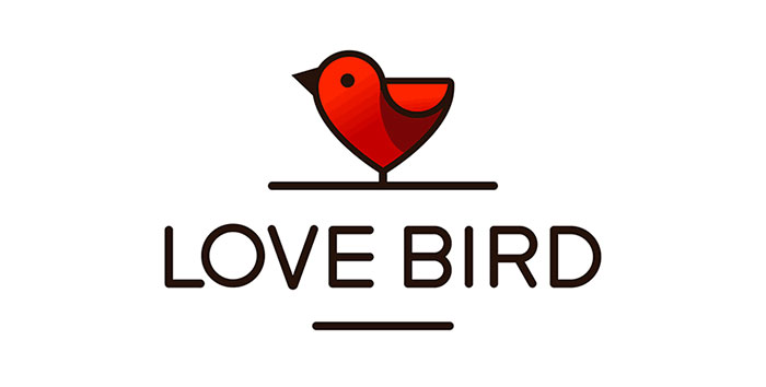
Image source: Piotr Gorczyca
Shapes are the bones of your design, and negative space? That’s the secret sauce.
Geometric symbolism – Circles can be all about unity and community, squares speak stability, and triangles?
They’re all about action. Pick your shapes like you’re casting characters for a play.
Strategic use of negative space for visual interest – It’s the Easter egg hunt of design.
That ‘aha!’ moment when you see more than meets the eye. Think the arrow in the FedEx logo. Sneaky, but oh-so-clever.
Crafting a Unique and Timeless Logo
So, you’re knee-deep in the process, figuring out how to design a logo that’ll stand the test of time. Not just any scribble, but something that’s gonna stick around, like those songs that never get old.
Originality and Distinction

Image source: Maxim Baluyev
Ever seen something and thought, “Wow, that’s fresh”? That’s the vibe we’re going for. Your logo should walk into a room of logos and be the one that turns heads.
Avoiding clichés and overused concepts – Like, if you’re doing a coffee shop, dodge the whole coffee cup thing. Everyone’s seen it a million times. Brew up something that hasn’t been served before.
Standing out in a crowded marketplace – It’s like being at a concert and you’re the one that catches the singer’s eye. You gotta be that kind of different. Think outside the box until the box is just a speck in the distance.
Flexibility and Scalability
Image source: Paul von Excite
This is the part where your logo does yoga, stretching and shrinking without losing its cool.
Adapting to different mediums and scales – Your design’s gotta look good on a giant billboard or a tiny app icon. It’s got to flex and fit everywhere, from a pen to a pixel.
Ensuring consistency across various platforms – Whether it’s a business card or the side of a bus, your logo’s gotta rock it the same way. It’s all about making sure that no matter where it shows up, it feels like home.
The Design Process

Okay, time to roll up those sleeves. We’re diving into the nitty-gritty of how to design a logo that’s gonna wow faces and melt hearts.
Digitalization and Refinement
First up, we’re taking those sketches and making them shine in the digital world.
Translating sketches to digital format – You grab your favorite design tool and get to work, tracing over your doodles and bringing them to life. It’s like the sketches are evolving, Pokémon-style.
Iterative design and refinement – You tweak, you turn, you flip it upside down. Play with it until it sings. And then, when it hits the right note, you know you’re onto something.
Black and White Prototyping
Now, this is crucial. Before color even enters the chat, your logo has to look sharp in plain old black and white.
Testing the design without color distractions – It’s gotta stand on its own two feet without the razzle-dazzle of colors. This is where you see if your design has the muscles to carry the brand.
Ensuring strong silhouette and structure – You want someone to be able to sketch your logo with their eyes closed. It’s got to have that iconic silhouette that’s recognizable in any shade.
Feedback and Revisions
Alright, let’s talk real talk about how to design a logo that doesn’t just float your boat but everyone else’s too. It’s like cooking a meal; you gotta taste it and maybe get a second opinion before serving it up.
Seeking Professional and Target Audience Opinions
So, you’ve got this draft and think it’s the bomb, but let’s see what the pros and the peeps you’re aiming to impress have to say.
The role of peer review – It’s like showing your pals your latest selfie before it hits the ‘gram. They’ll tell you straight if it’s fire or if you need another shot. Design buddies can spot the snags and give the kind of real talk you need to polish that gem.
Incorporating feedback from potential customers – It’s their eyeballs you want on that logo every day. Do they dig it? Does it make them want to be part of your tribe? That’s the gold you’re mining for.
Iteration and Improvement
Now, don’t get all defensive if the feedback stings a bit. It’s all about the glow-up. Take those critiques and channel them into your masterpiece.
Refining based on critiques – Chisel away like a sculptor. Each piece of feedback is a chance to chip off the rough edges.
Balancing creativity with practicality – Sure, go wild with the creativity, but if it’s not practical, like, if no one can read the thing, it’s no bueno. Keep it creative, but keep it real.
Finalizing the Logo Design

Image source: Second Eight
We’re on the home stretch of how to design a logo that’s about to take its place in the spotlight. It’s showtime, but with a cool head.
Application and Contextualization
Think about where this logo’s gonna live. A sleek and shiny sign? A hashtag-worthy t-shirt?
Visualizing the logo in real-world applications – Mock it up! Slap that baby on everything from business cards to billboards in your mind’s eye. It’s gotta look just as fly on a 2-inch screen as it does on a 20-foot sign.
Creating a versatile and adaptive design – You want this logo to be like a chameleon, blending into wherever it’s placed but still popping.
Creating a Style Guide
Now, don’t just send your logo out into the world without a map. Give it a guide so it doesn’t lose its way.
Establishing usage guidelines – Like, ‘Here’s where you can take creative liberties and here’s where you can’t.’ Make sure it’s not getting squished, stretched, or recolored in funky ways that’ll make you cringe.
Ensuring brand consistency – It’s all about that familiar feel, no matter where someone stumbles upon your logo. Consistency is the secret sauce of branding. It’s like that one filter you use every time because it just makes everything look better.
Launching the Logo

Image source: Nikola Matošević
So, you’ve created this kick-ass logo, and now it’s time to let it loose into the wild. Think of it like dropping the hottest track of the summer; you want it to make waves.
Rollout Strategy
Dropping a logo isn’t just an upload-and-go situation. You’ve got to hype it up. Create a buzz. Like a teaser for the newest binge-worthy series, you’ve got to get people on the edge of their seats, waiting for the big reveal.
- Introducing the logo to the market is kinda like introducing your new puppy to the world. You want everyone to love it as much as you do. So, tell a story. Why this look? What’s the vibe? Make it personal.
- Strategies for unveiling the new design – You could go all out with a launch party or keep it chill with a social media countdown. Whatever floats your boat, make sure it’s memorable. Maybe even a little drumroll before the big ta-da moment.
Handling Criticism and Praise
Look, not everyone’s gonna be a fan, and that’s cool. Like pineapple on pizza, it’s not for everyone.
- Responding to public feedback – Listen, engage, and if there’s a point to it, learn from it. Don’t throw shade; just shine brighter.
- Adapting the design post-launch if necessary – If something’s not hitting right, be ready to tweak. No shame in a little logo glow-up if it needs one.
Lovely Logo Examples To Inspire You

Image source: Jacek Janiczak

Image source: Kanat Karapashov

Image source: Max Iskra

Image source: Sergey Lobzenko

Image source: Pen&Brain

Image source: Randy Heil

Image source: Stefan Brown

Image source: Stanislav Povzhik

Image source: Nikita Lebedev

Image source: KabuqueJoe

Image source: Randy Heil

Image source: Lukasz Piskorek
FAQ on Designing a Logo
What’s the first step in designing a logo?
The very first thing you do, before you even doodle on a napkin, is to get to know the brand. Like, what’s the vibe? Who are they chatting up (their audience)?
And what’s the chat about (mission)? It’s like being a detective in a sea of brands, hunting for clues about what makes this one tick. You’re digging for the gold that’ll shine through in your design.
How much does it cost to design a logo?
Talk about a “how long is a piece of string” question, right? Cost can be a real rollercoaster.
You might find a buddy who’ll do it for a case of beer, or you could hire a swanky agency that’ll charge enough to make your eyes water. Bottom line, you get what you pay for. Invest in a good designer, and it’s like buying the secret sauce that’ll make your brand sizzle.
Can I design a logo myself?
Absolutely, you can take a swing at it! It’s like making your own coffee – it might not be barista-level at first, but hey, it’s yours. There’s a ton of DIY design tools out there, for example this AI logo maker.
Just remember, your logo design is your brand’s handshake. If you’re cool with it being a little wonky while you learn the ropes, go for it. But if you want that firm, confident grip right off the bat, maybe call in a pro.
What are the best colors for a logo?
Best colors, huh? Well, it’s like picking the right outfit for a first date – it’s gotta give off the right impression. Each color whispers something different.
Blue screams trust, red’s all about the energy, green’s chill with nature vibes. But it’s not just about being pretty. It’s about what story you’re telling. So, pick colors that’ll spill the beans about your brand without saying a word.
Should my logo have a symbol or just text?
Ah, the old symbol versus text duel. It’s like asking if you should have ketchup or mayo on your fries. Some brands kill it with just a sleek font (think high-fashion labels), while others need that little doodad that you can’t unsee. The trick? Knowing what will stick in folks’ minds. Sometimes a symbol says it all; other times, your name in a killer font is the mic drop.
Btw, If you need more information on setting up your logo name, Logaster has put together a full guide on how to do this and gives you 50+ Free Company Name logo ideas
How do I choose a typeface for my logo?
Typefaces are like the voice of your brand. Choosing one is like auditioning singers for your band – it’s gotta hit the right notes.
A tech company might want something sleek, sans-serif, all clean lines and no fuss. A bakery? Maybe something with a bit more twirl, like script that makes you feel all warm and sugary inside. Match the typeface to your brand’s personality, and you’re golden.
What makes a logo memorable?
Memorable, eh? It’s all about the hook. Think of it like the chorus in your favorite song. Simple, a bit of a surprise, and sticky as heck. A twist on the familiar, maybe a dash of wit.
Look at the big guns – Apple, Nike, McDonald’s. They’re champs at keeping it simple but bold. Your logo should pop up in someone’s head when they’re zoning out. That’s when you know you’ve nailed it.
How long does it take to design a logo?
It’s like asking how long a piece of string is, isn’t it? Could be a quick sketch on a lazy afternoon or months of back-and-forth. It’s a process, with layers.
Sometimes inspiration strikes like lightning, and sometimes it’s a slow burn that needs to simmer. The key is not to rush it. You’re not just making a logo; you’re baking a brand pie, and those flavors need time to meld.
What’s the biggest mistake people make when designing logos?
Jumping the gun. It’s like wolfing down a burger before it’s fully cooked. Folks often sprint past the brainstorming phase and trip on their own shoelaces.
They go all in on a design without checking if it actually fits what their brand’s chatting about. It’s gotta be more than just eye candy; it needs to have the brand’s DNA twisted right into it. Skip that, and you might as well be speaking gibberish.
How can I make sure my logo stands out from competitors?
Standing out? That’s the spirit. It’s like showing up to a costume party as the only person with an LED suit. Research what the others are doing and then zag where they zig.
Carve out your own little island in the sea of sameness. Infuse your unique brand story into every curve and color of your logo. Make it so distinct that it could only belong to you.
Conclusion
Here we are, end of the road on how to design a logo. It’s been real. A mix of art, psychology, and straight-up strategy. Remember, logos are the face of the brand. They’re the wink across the room that says, ‘Yeah, you wanna know me.’
Crafting a logo is like creating a personality. It’s got to have its own flair, a bit of mystery, and a whole lot of ‘come hither.’ But above all, it’s got to be true to what it stands for.
So when you’re down in the design trenches, remember it’s not just about making something look pretty. It’s about making a mark. That’s what how to design a logo is all about. Creating something that can stand the test of time, adapt like a pro, and look darn good while doing it.
- Vintage Color Palettes That Bring the Past Alive - 16 April 2024
- The Ubisoft Logo History, Colors, Font, And Meaning - 16 April 2024
- Trending Tones: The Most Popular Color Palettes of the Year - 15 April 2024


