WordPress 15 Top Free & Premium Tools & Resources for Designers in 2024 It’s 2024, and the web design tools and resources market keeps humming right along. It was once said that: “everything... BY Bogdan Sandu 21 February 2024 0 Comment
Misc Brochures Are Still Relevant in 2024 Brochures are the perfect way to get your business buzzing! So, If you want to boost your sales this season,... BY Bogdan Sandu 14 February 2024 0 Comment
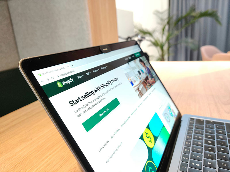
Misc How to Build and Promote a Shopify Website Thanks to technological advancements and the advent of the internet, for three decades now, businesses have been able to grow... BY Bogdan Sandu 12 February 2024 0 Comment
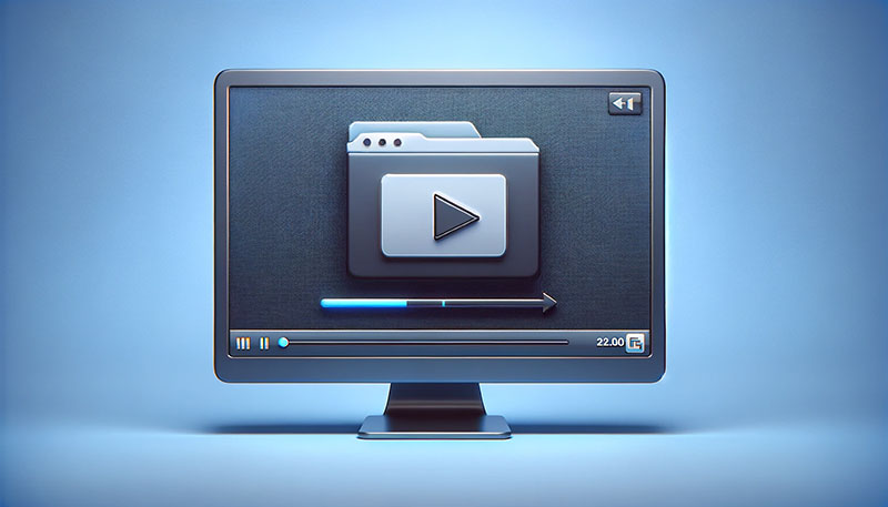
Misc Top 8 Best Free Video Compressors [2024] Have you ever faced the challenge of sharing a large video file, only to be stumped by size limits? Whether... BY Bogdan Sandu 2 February 2024 0 Comment
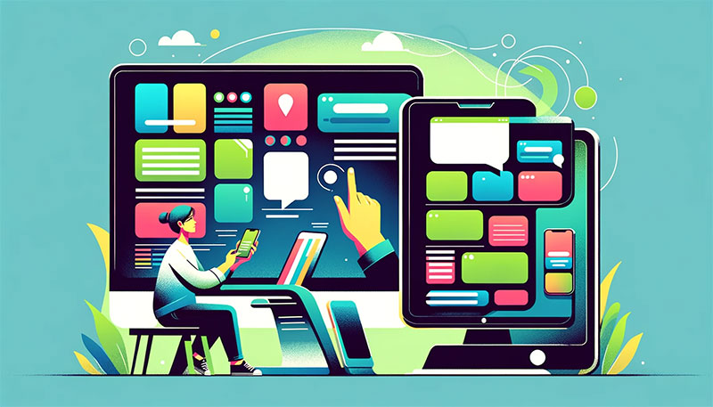
Misc How to Make a Website that Attracts Visitors and Leads Living in the digital era, when people do everything online, it’s a must for any business to have a website... BY Bogdan Sandu 31 January 2024 0 Comment
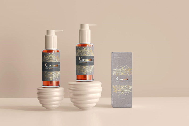
Misc How to Create Wrap-Around Label Designs for Tube-Shaped Packaging: 7 Tips Crafting a captivating label design for tube-shaped packaging can be as exhilarating as it is challenging. As your product hits... BY Bogdan Sandu 22 January 2024 0 Comment
Misc The Evolution of Rich Media Ads In the world of digital advertising, it’s important to stay ahead. Rich media ads captivate audiences and bridge pages guide... BY Bogdan Sandu 17 January 2024 0 Comment
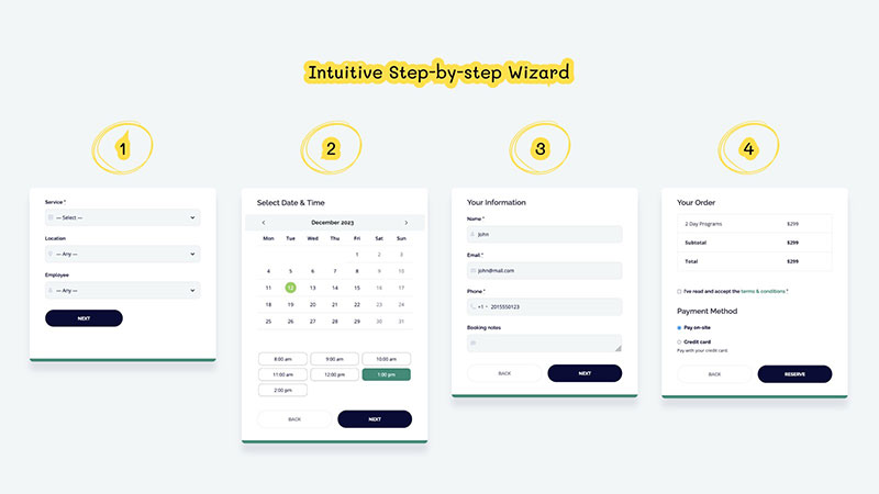
Misc Maximizing Efficiency: Automating Your Business with WordPress Appointment Plugins The automation of reservations through appointment booking plugins is a key driver of efficiency and customer satisfaction in an increasingly... BY Bogdan Sandu 11 January 2024 0 Comment
WordPress 8 Awesome WordPress Plugins To Use in 2024 The 59,425 free to use plugins on WordPress.org cover almost every functionality for every website you can think of. In... BY Bogdan Sandu 9 January 2024 0 Comment
Misc 6 Creative Ways to Monetize Your Digital Art Digital art has become increasingly popular in recent years, with more and more artists turning to digital platforms to create... BY Bogdan Sandu 3 January 2024 0 Comment